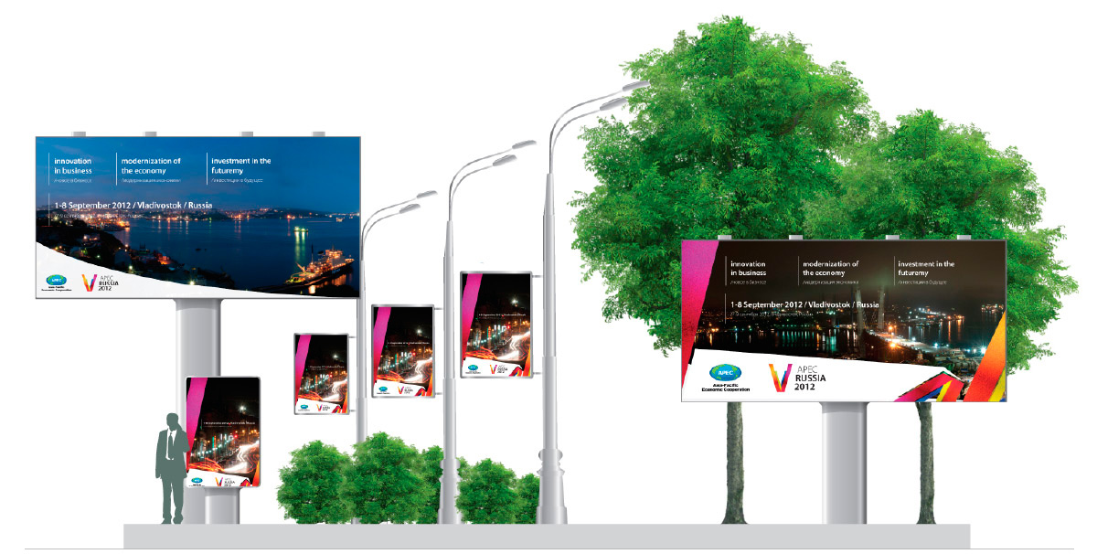
Identity for APEC 2012
Design logo of Russia’s presidency in the forum, “Asia-Pacific Economic Cooperation” and unified artistic and stylistic the meeting venue of the APEC summit in Vladivostok in 2012.
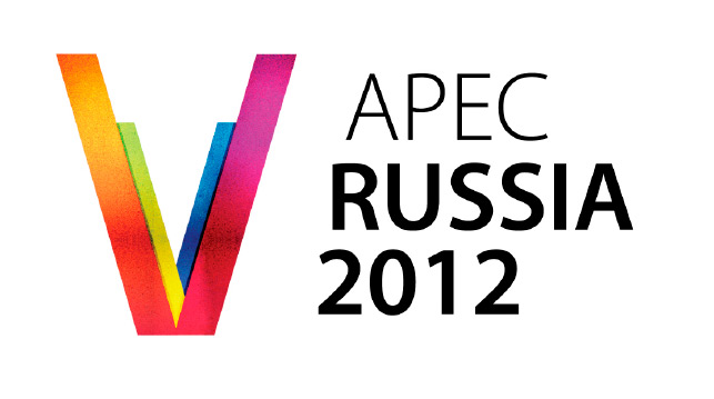
Description of the idea concept style
Simple sign with multiple meanings:
V – is Vladivostok;
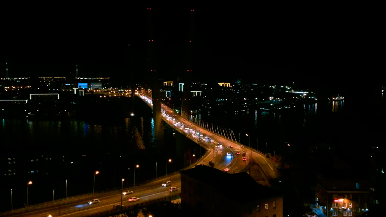
V- one of the most publicized characters summit in the Far East – stayed bridge;
V – A stylized inverted abbreviation of APEC;
V – victory (a victory, leadership).
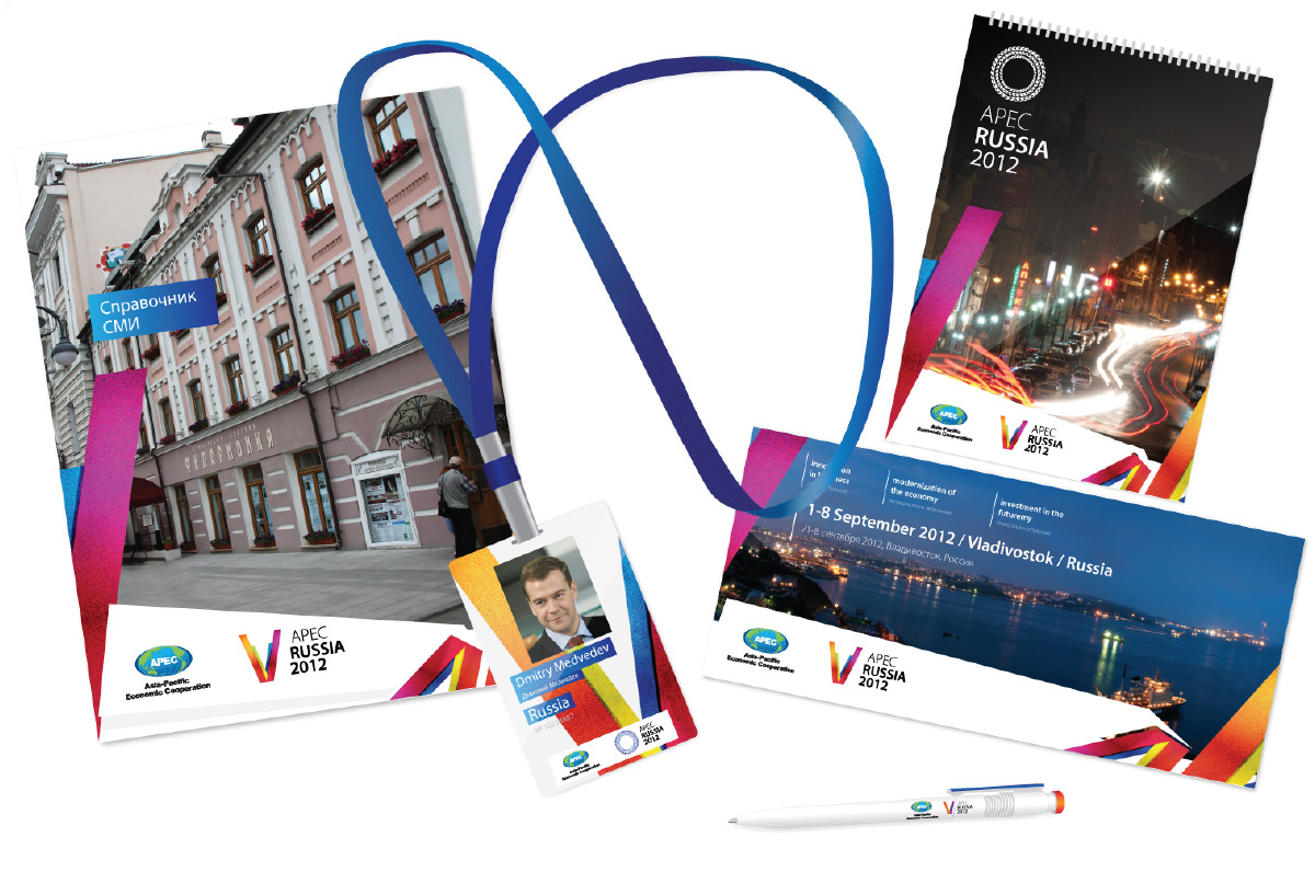
Sign of the official logo Forum
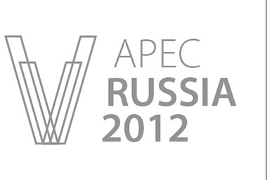
Business records
Color scheme of the logo is a combination of colors, associative associated with the Primorye territory and Vladivostok: green – the color of the Maritime taiga, the blue color of the sea, orange and yellow – the colors of sunshine and optimism, red is a symbol of energy and activity.
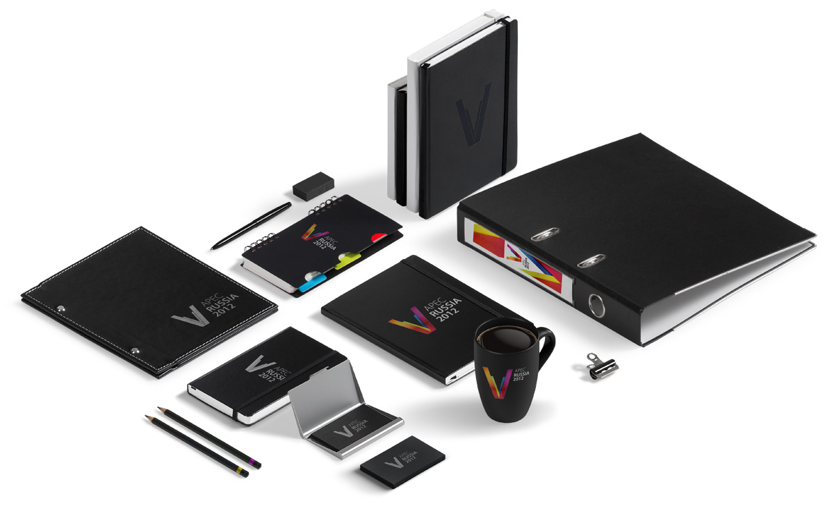
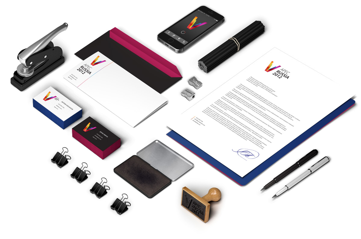
Functional advantages: ease of replication; the possibility of using parts of the logo, as elements of design of advertising materials.